I already told you about the various styles within the Round Hand family, and why writing masters needed to distinguish between each of these styles. Before telling you more about the classic Round Hand itself, I feel like it would be interesting to dive into the family tree of this writing style and uncover a little of the history behind the evolution of our handwriting systems. I’m going to start with the oldest one in the family : the Italian hand.
The Humanistic hand
The story starts at the end of the Middle Ages in the Italian peninsula, when the Florentine intelligentsia started the Renaissance movement. Their aim was to put Man at the center of preoccupations : to know God’s creation better, they thought that they needed to know more about Man himself. Humanists turned their back on what they called the “dark Middle Ages” and dove into to the works of classical authors in order to revive the cultural legacy and moral philosophy of classical antiquity. They wanted the modern men to be free and civilized, literate and curious… Naturally, they needed an appropriate, elegant, fast and legible new writing style to spread their new ideas.
For that reason, the Humanistic hand is considered to be the result of a deliberate cultural choice, rather than of a natural evolution of the medieval writing styles. The Humanist scribes found the inspiration for their small letters in the old carolingian minuscule that they believed was the ancient roman script, and found their capitals engraved in antique stones such as the Trajan column.
First, Poggio Bracciolini created a formal book hand very similar to today’s Foundational hand, then Niccolò Niccoli created a cursive version of this humanistic hand – the ‘antica corsiva’ – which became the official script for briefs by papal chancery scribes in the 1430’s. Several generations of Vatican scribes perfected it, making it even more cursive and fluid, and their work spread the Cancellaresca throughout the catholic world.
Italy was becoming very prosperous at the time. Trade was an important part of the economic development of cities like Venice ; italian banks were becoming important institutions (the Medici family in Florence founded the biggest bank in Europe) ; people had access to knowledge like never before ; Italian artists and scientists experimented and made wonderful discoveries… And all these people and institutions were ready to start using the new, faster and easier writing style. Good writing teachers were extremely popular, and the development of the printing press made it possible for them to spread their knowledge in a new way.
The first copy-books
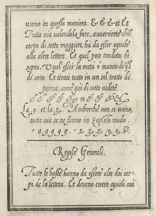
In 1522, almost a century after Niccoli developed his cursive hand, Ludovico degli Arrighi published the famous La Operina, the very first copy-book with instructions on how to execute the cursive Cancellaresca. Arrighi relied on geometric shapes – a rectangle with rounded angles – to simplify the understanding of his script ; his style was simple and legible, with few but elegant flourishes. In the hands of other masters such as Tagliente and Palatino, the Cancellaresca kept evolving. Some would write in a very flourished ornamental style, others would distinguish between complex formal and cursive variations ; these books were extremely successful and the italian hand spread across Europe, amongst intellectuals and aristocrats…
Italy was at the peak of its “golden age of calligraphy” until the 1560’s when the Counter-Reformation started. Suddenly, the complex and frivolous cancellaresca hands were harshly criticized ; new calligraphers started to advocate the return to a purely utilitarian hand.
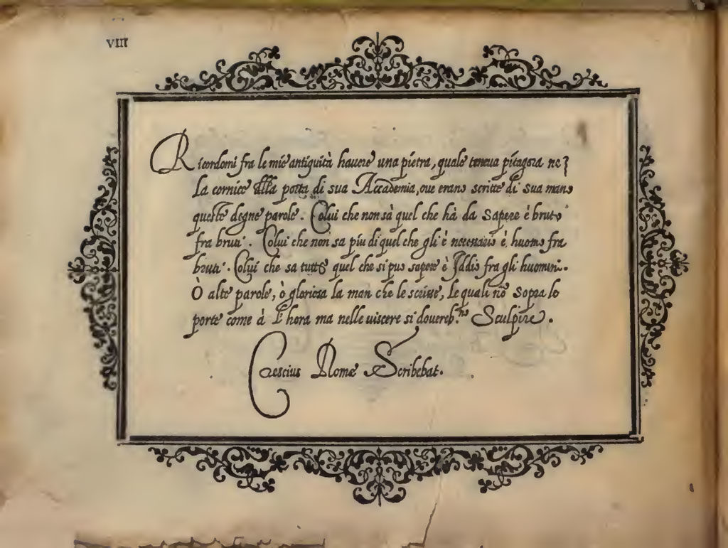
Gianfrancesco Cresci was the one who ended up revolutionizing the European writing styles by publishing his Essemplare di Piu Sorti Lettere in 1560. His ‘cancellaresca testeggiata’ featured bulb-headed ascenders and descenders written with a new lightweight flexible quill cut with a rounded nib. The letterforms were freed from the principles of geometry, they were rounder, more slanted and flowed easily into one another. Flourishes still had their place, they were executed with virtuosity but didn’t affect the legibility and speed of the script. The modern Italian Hand was born.
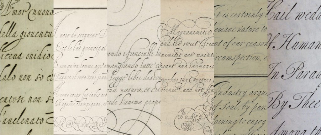
Cresci’s new hand became extremely popular in western European countries, first amongst educated people, then it was adopted by merchants who liked that it could be read by their foreign clients without difficulty. Of course the style didn’t stay exactly the same over time : a few factors allowed it to evolve into the simpler ornamental shapes displayed in the Universal Penman.
The copper engraving revolution
Throughout the history of writing, variations were caused by a series of factors. Speed, for example, is an important one : when speed was not important, the writing style would end up being formal and decorative. Overall, the hand would always be adjusted to fit the needs of those writing it and the tools that they would use. But in the case of the Italian Hand’s evolution, the printing process also had something to do with how the script evolved.
The first writing copy-books were all printed from wood blocks. The method gave acceptable results, but writing masters knew that they couldn’t rely on the block cutter to reproduce finer details. Their designs had to stay relatively simple, and their copy-books only conveyed the basic principles of the various writing styles represented.
But from 1569, when engravers were finally able to reproduce good letterforms on copper-plates, the copy-books themselves began to change.
Cresci’s popular new direction in writing seemed ideally suited for reproduction by the graver. The results were stunning : the subtle contrasts of the printed letterforms were enhanced by the new method of engraving, it gave a crisper image and allowed to reproduce small examples of the script as well as elaborate flourishings known as ‘command of hand’. From then on, writing-masters wouldn’t have to just focus on giving basic instructions on writing, they would be able to design and publish the most elaborate artworks… And so they did.
Different countries, Different styles
Without a doubt, the best letter engravers of the late 16th and beginning of the 17th century were Dutch, and so the most impressive copy-books of the period were published in the Low Countries. There, the Writing Masters became proper artists for a time : their works were celebrated and collected, translated and published abroad… In their hands the beautifully simple Italian letterforms, freed from the strained wood engraving technique, subtly evolved into a more expressive writing style. And, as the best calligraphers engaged in friendly competitions that pushed them to invent new and impressive flourished designs, the Italian hand also began to be used as an ornamental hand.
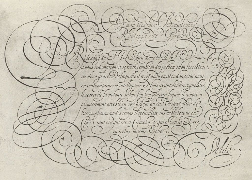
Naturally, some penmen who were less gifted exaggerated on the “flourishing” and neglected the writing itself. Some books published during the early 17th century are a decadent display of spaghetti-looking designs that may have been “enhanced” by the engraver in order to impress the crowds… and give the impression that the author was a suitable writing teacher. The method may have paid off in some cases, but it also brought about the mistrust of the general public towards engraved copybooks.
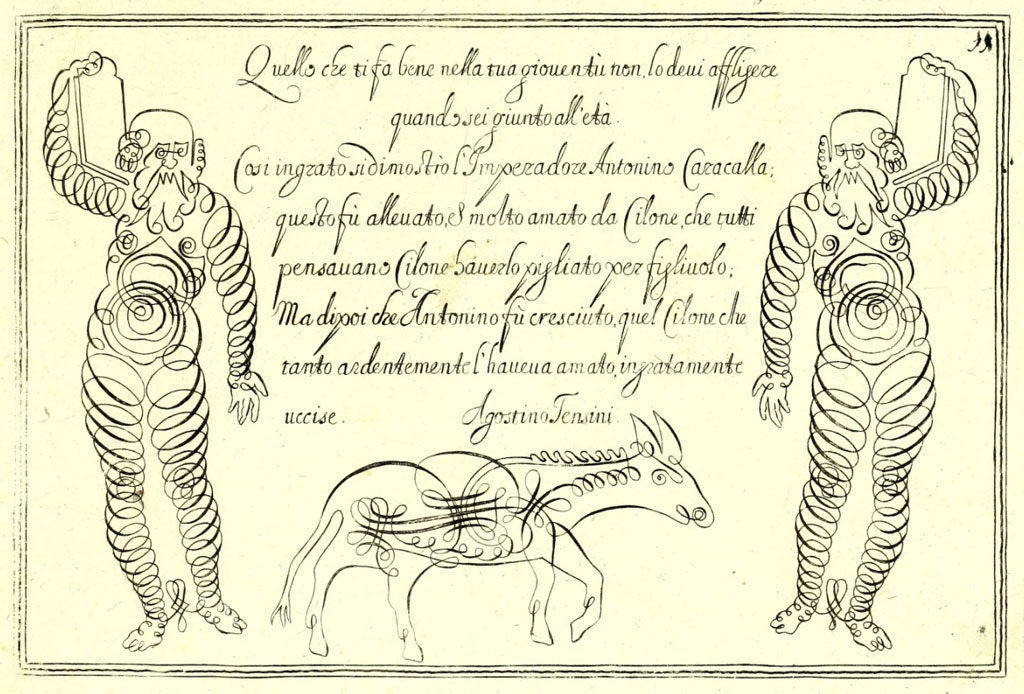
However, this didn’t discourage the better educated writing masters, who nevertheless published and sold many good looking writing books. One of these masters was a Frenchman called Lucas Materot, whose models were considered superior to the original Italian masters’. His works were very influential in the development of the French “Italian Bastard” which served as a model for the English Round Hand itself. His Italian hand examples were also very influential abroad, as the Italian hand remained one of the main hands used for business until it was replaced by the English Round Hand.
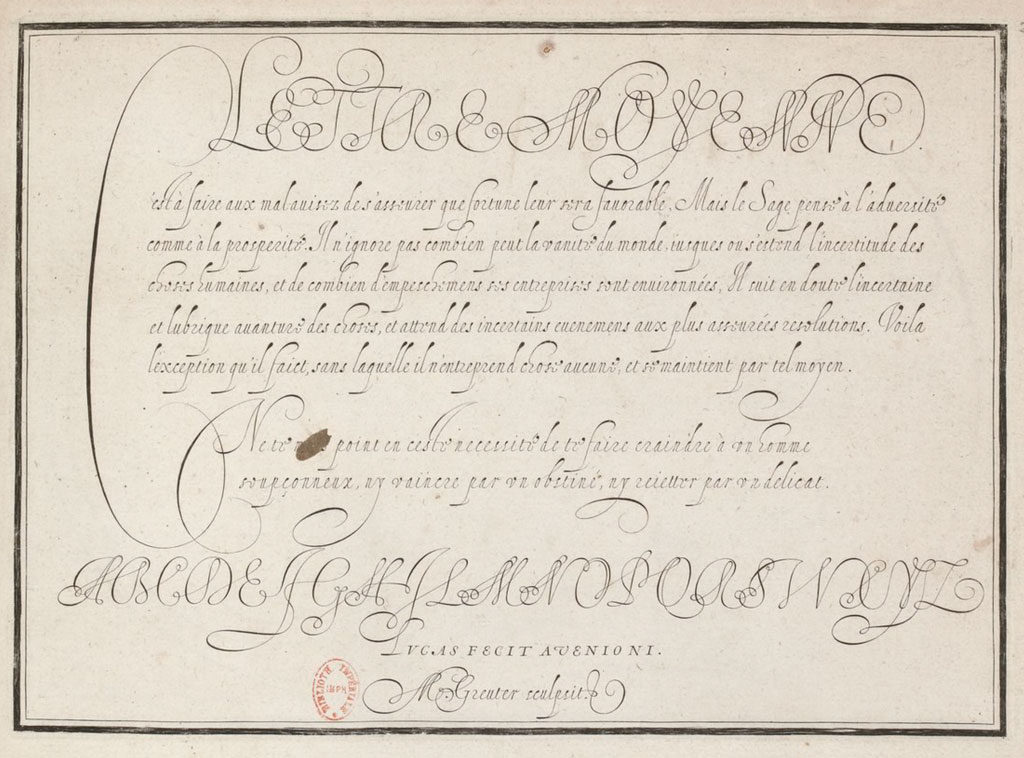
In England, masters like Martin Billingsley and John Davies published their own models of the Italian hand, which were more straightforward than what was published on the continent. Later on, Edward Cocker published at least 17 copybooks over the course of 25 years ! As finding suitable letter engravers seemed to have been an impossible task for writing masters, Cocker decided to engrave his own works himself. Luckily, he was as talented with the graver as he was with the quill, which allowed his books to dominate the market from the 1650’s to the 1690’s. The Italian hand takes a lot of space in his books, and he seems to have loved the freedom of movement it allows, as his style was much more ornate and “enthusiastic” than that of his predecessors. He was later criticized for his love of flourishing, but he thought of these “striking” designs as a playful way to gain control over the writing tool.
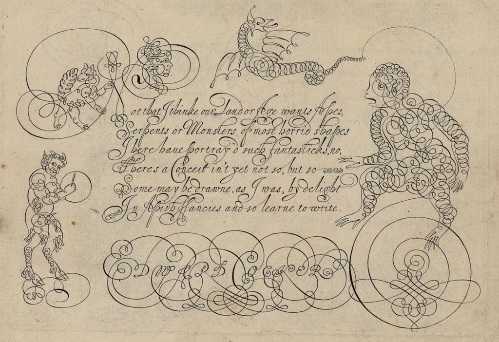
At the turn of the 18th century, when the English Round Hand eventually took the place of the Italian hand as Britain’s favorite “business” writing style, the Italian hand didn’t disappear… Even though Writing Masters dedicated less space for it in their copybooks, it was kept as an ornamental hand, used to emphasize and add variety to their designs. Because of its delicate and graceful appearance, ladies were encouraged to use it as a handwriting style.
Technique
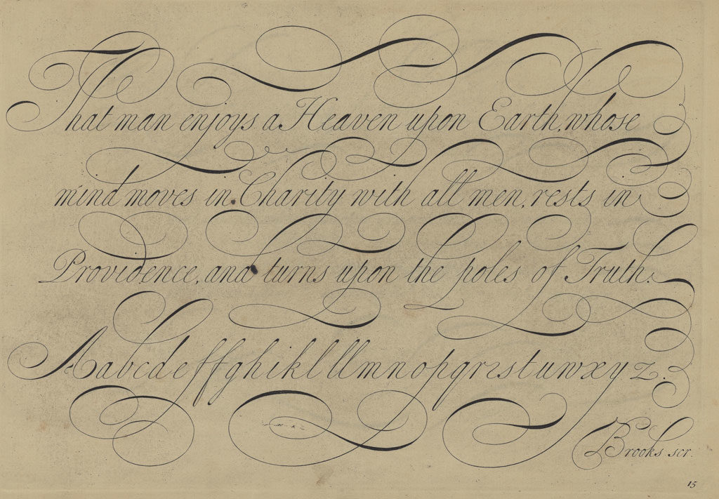
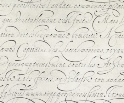
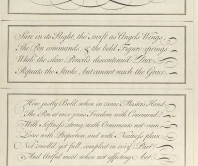
Looking at 18th century models of the Italian hand, one of the first things I noticed is the way shades are placed on capital letters, as if they had been written backwards.
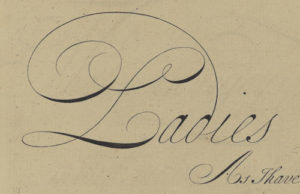
It doesn’t seem very practical, so I wondered how masters managed to write that way and if it had always been a feature of the Italian hand…
It turns out that such capitals made their appearance in copybooks around the same time the French Bastard (and thus the Round Hand) did… Cresci, Materot, Velde, Billingsley and even Cocker’s models were written using the same kind of ductus we use for regular round hand capitals. Moreover, the kind of pen they were using seem to have been cut broader than the kind of pen used for the modern version of the hand.
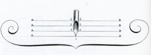
So why this fairly sudden change ?
My theory is that as the Italian Hand’s models of majuscules were used for the Round Hand, masters had to find a way to differentiate both hands without coming up with new forms of capitals. Because the Italian Hand was favored for ornamental work, it makes sense that its capitals would be more flourished, and in order to be able to keep the same overall shape of letter, masters had the idea to write their capitals using the position for “striking”, or off-hand flourishing.
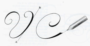
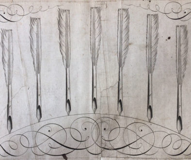
Holding the pen this way while using the “regular” ductus allows to get the shades on the upstroke… This method also makes more intricate designs possible, using whole arm movement. Naturally, changing pens while writing a sentence makes no sense, and this kind of penhold usually required a fairly pointed and flexible quill, so they chose to use this cut for the capitals as well as the lowercase letters… even though it looks like the penhold was changed to write lowercase, which made the hand look consistent in spite of the change in shade orientation.
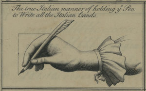
Of course, this is only speculation…
Either way, 18th century British writing masters used Italian capitals with Italian hand lowercases as well as with round hand lowercases… Which makes it harder for us to see the difference between them. Both hands go very well together because they were built on the same oval principle. As Cocker wrote in Pen’s Triumph (1659) : “On Oval wheels should fair Italian run, Smooth as the Whirling Chariot of the Sun”. Looking at the images above, you may however see that the underlying oval shape of the Italian hand became slightly slender and more slanted over time…
Today, there are two ways of reproducing the modern Italian Hand : you can chose to use the traditional “offhand” pen position, which makes the use of an oblique quite impossible… Or you can decide to learn how to write the letter backwards, which is an interesting exercise and allows you to use an oblique (even though shades will be better placed using a straight holder). Alternatively, you could also write the letter without using pressure and choose to add the shades afterwards, but this method gives less natural results.
If you are looking for books containing models of the Italian hand, you will find plenty in the bibliography section (17th century). My favorite authors are Materot, Velde, Maria Strick (who won a prize for her Italian hand), Frisius, Roelands, Cocker… And for the 18th century version : Ayres, Snell and Shelley (among others).


Should you advise where and how can I get those clear digital copy of the examples for the Italian Hand, instead of digital copies from google book?
Unfortunately you can’t get copies of all the books cited in this post as there are no digital copies freely available… unless you go to a library that has the book and allows visitors to take pictures. The images here are pictures I took myself at the libraries I visited. You can however take a look at the digital copies of many copybooks linked in the bibliography section. There are many links, even though many are not top quality, some are quite usable for calligraphy study. For 18th century italian hand in the English style, I’d recomment George Shelley’s 2nd… Read more »
Thank you very much for the prompt response.
It’s such a rare treasure to see examples of this ancient style, I appreciate the page and history in all its splendour, thank you.